More than 120 posters by outstanding Dutch artists - Gielijn Escher and Lex Reitsma - will be displayed from 9 June until 9 August in the Open-Air Gallery of the Royal Łazienki by Aleje Ujazdowskie avenue.
The exhibition of the artists’ works will be the fifth instalment of the "Cultural Poster" project curated by a well known Polish poster artist living in France, Michał Batory. Each year since 2012, posters by two artists from a featured country have been exhibited in the Open-Air Gallery of the Royal Łazienki. So far, these have been: Poland, France, China, Japan, and Mexico
This year, the time has come for works of Dutch artists. However, as Katarzyna Matul - art historian and critic - emphasises, Gielijn Escher and Lex Reitsma do not follow the main currents of Dutch graphical design. - They both oppose the leading modernist trends which stem from experiences of graphical artists such as Piet Zwart or Paul Schuitema, and followed in the second half of the 20th century by the famous Wim Crouwel, founder of the Total Design studio - Katarzyna Matul writes in the catalogue to the Dutch poster art exhibition.
- Although Escher and Reitsma value the functional perfection of the works of those designers, in their own work they aspire for something else. The strive above all to refer to the content of the presented topic and to express a personal view by means of an original form - not so much an effective form, but simply an intriguing one. Escher achieves the goal with manually created typographic and graphic compositions which can be distinguished by colours shown on a black background. Reitsima mainly uses photographic material, which, combined with typography, produces an indivisible graphical and informational entirety - Katarzyna Matul explains.
The exhibition of Dutch posters in the Open-Air Gallery is part of the celebration of Dutch presidency in the Council of the European Union and one of the events of the Dutch Days in the Royal Łazienki.
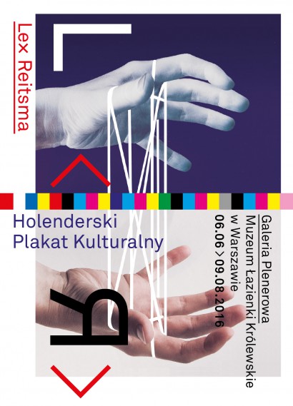
Lex Reitsma - The Hands Speak, and the Eyes Listen
How is it possible to evoke the atmosphere of a multi-dimensional opera performance - which includes music, acting, costumes and stage sets - on the two-dimensional plane of a poster? This is the question Lex Reitsma has been addressing for twenty-four years, in response to the prestigious commissions he has received from the National Opera in Amsterdam. The results of his collaboration with Pierre Audi, the theatre’s artistic director, are subtle compositions which awaken the senses. They are the product of Reitsma’s own ideas as well as the fulfilment of the expectations of the organizers of the performance. Audi has placed great trust in the poster designer and allowed him the freedom of interpretation, thanks to which some of the images advertising the opera are a clear reference to its stage adaptation; at other times the poster, libretto and opera performance enter into a dialogue, as it were, and complement each other perfectly.
In the process of designing the posters, meetings were held with the director and performers a couple of weeks before the start of rehearsals. It was in the course of these crucial discussions and conversations that Reitsma would come up with his first ideas for the main theme of the composition, as well as the predominant colour and typeface. There is nothing accidental about Reitsma’s posters; every detail is used to build complex layers of meaning, the aim of which is to intrigue the viewer, to stimulate his imagination, and to give him an inkling of some of the magic that is released in the opera performance. Reitsma does this in a very subtle way by engaging the viewer’s senses in the same way as the opera does. There is nothing obvious here, it is a world full of unexpected combinations - and transformation - of motifs which we know from everyday life: a bird perched on a shoemaker’s last (The Mastersingers of Nuremberg), a musical note made of paper (Capriccio), a face composed of oranges (The Love for Three Oranges), a fox’s tail which comes out of a shotgun (The Cunning Little Vixen) and the tri-coloured camelia which forms the background for a clock (La Traviata). These motifs are intriguing, but not obtrusive. And yet, the poster designer could play with the viewer’s strongest emotions, because, after all, the world of opera is full of painful betrayals, ruthless killings and ardent love.
Reitsma does not create dramatic images that would compete in the urban space with frequently radical social campaigns and brutally realistic advertisements for consumer products. Instead, he transports passers-by to a more beautiful place, allows them to experience a moment of poetry, while at the same time encouraging them to continue this experience at the performance itself. Beyond his repertory of everyday objects, Reitsma’s favourite motifs include parts of the body, in particular, hands. They speak with gestures, although this language is not always clear to the viewer, who may not be familiar with the plot of the opera. It can be compared to sign language, in which the layman looks for meanings close to the symbolism known to him from everyday life. The gentle touch of two hands, shown reversed, and arranged symmetrically, on the poster for La Bohème does indeed suggest a love story, but only deeper knowledge of the libretto allows the viewer to fully interpret the meaning of the image. The key to understanding it is, in fact, the white wedge which cuts through the photograph of the linked hands. In this subtle way Reitsma symbolizes the dramatic love story of Rodolfo and Mimi living in nineteenth-century Paris. The lovers search for love, but neither one of them is capable of loving. The story becomes even more complicated when it transpires that Mimi is terminally ill. In Audi’s adaptation of the opera, the lovers hands do not touch until Mimi’s death and it was precisely this moment which Reitsma decided to portray on his poster.
Reitsma also makes use of reversed images of hands on the poster for the opera Castor and Pollux, which tells the mythological tale of two brothers, one of whom is immortal. This difference between the two brothers, which heightens the drama, is symbolically portrayed using a photograph of two hands; one is shown against a neutral background, the other is set against a starry sky. The bond between the two brothers is expressed by a thread connecting their hands, reminiscent of the popular children’s game: cat’s cradle. On the poster for Wagner’s The Flying Dutchman, hands with visible epidermal ridges are the most important feature of the photograph of the mysterious figure who is trying to forcibly break through a glass barrier. According to palmistry, the lines on a person’s palm foretell their fate - in this case it is the tragic destiny of the Dutchman, an unfortunate sailor who is searching for true love which would release him from his tortuous wanderings. In Reitsma’s opera projects, hands are also those parts of the body that commit crimes: they hold axes (Iphigenie in Tauris) and traces of blood remain on them after the crimes have been committed (Elektra, William Tell, The Stigmatized.
Reitsma’s posters do not belong to the world of ancient tales; they have a contemporary feel, enhanced by the use of photography and typography. The latter plays a key role in his designs. Carefully selected typefaces not only have an important informative role, but also a visual one. They are fully-fledged elements of the composition, along with the image, such as, for example, the excellent poster for the opera Wozzeck, where the main title is an extension of the outline of a house into which the protagonist is trying to gain entry.
These projects by the Dutch artist are part of a wider European design trend for those theatres and operas which are dusting off libretti from the past and adapting them to meet the expectations of contemporary audiences. Lex Reitsma in Amsterdam, like Michał Batory in Paris, Werner Jeker in Lausanne and studio Homework in Warsaw, gets to grips with the task of presenting the topicality of the subjects covered by the opera and theatre performances. In this way he demonstrates that in the twenty-first century although the actors on stage and in life change, feelings and emotions such as tragic and unrequited love, betrayal and brutal crimes continue to be an inherent part of human life.
Katarzyna Matul
Lex Reitsma (b. 1958 in Delden, The Netherlands). In 1983 he graduated from the Gerrit Rietveld Academie in Amsterdam, specializing in graphic design. For more than twenty years he designed posters for the Dutch National Opera. Fifteen of his works were nominated for the Dutch Theatre Poster Award. In 1994 he won this award for his design for the opera Orpheus and Eurydice, and in 2004 he was awarded the general public’s award for his poster for La Bohème.
In 2001 a book about his designs for the Dutch National Opera was published. This publication received the Hendrik Nicolaas Werkman Prize. In 2014, the Stedelijk Museum in Amsterdam featured his works as part of its Opera in the Stedelijk exhibition.
In addition to posters, Reitsma also designs catalogues, books and postage stamps. He has been awarded the Frans Duwaer Prize for his work (1982), and was nominated for the Prix de Rome (1987). He has received awards for 'The Best Books Designs' in The Netherlands for more than twenty-five books that he designed.
His works are housed in the collections of the Museum of Modern Art in New York and the Stedelijk Museum in Amsterdam.
As well as being a busy graphic artist, Reitsma also produces documentary films, which touch upon subjects related to art and design.
Curator: Michał Batory
Coordination: Magdalena Majewska
Texts: Katarzyna Matul
Translation: Anne-Marie Fabianowska, Monika Lipińska
Editing and proofreading: Paulina Sieniuć, Anne-Marie Fabianowska, Maria Aldridge