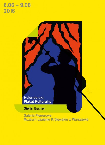
More than 120 posters by outstanding Dutch artists - Gielijn Escher and Lex Reitsma - will be displayed from 9 June until 9 August in the Open-Air Gallery of the Royal Łazienki by Aleje Ujazdowskie avenue.
The exhibition of the artists’ works will be the fifth instalment of the "Cultural Poster" project curated by a well known Polish poster artist living in France, Michał Batory. Each year since 2012, posters by two artists from a featured country have been exhibited in the Open-Air Gallery of the Royal Łazienki. So far, these have been: Poland, France, China, Japan, and Mexico
This year, the time has come for works of Dutch artists. However, as Katarzyna Matul - art historian and critic - emphasises, Gielijn Escher and Lex Reitsma do not follow the main currents of Dutch graphical design. - They both oppose the leading modernist trends which stem from experiences of graphical artists such as Piet Zwart or Paul Schuitema, and followed in the second half of the 20th century by the famous Wim Crouwel, founder of the Total Design studio - Katarzyna Matul writes in the catalogue to the Dutch poster art exhibition.
- Although Escher and Reitsma value the functional perfection of the works of those designers, in their own work they aspire for something else. The strive above all to refer to the content of the presented topic and to express a personal view by means of an original form - not so much an effective form, but simply an intriguing one. Escher achieves the goal with manually created typographic and graphic compositions which can be distinguished by colours shown on a black background. Reitsima mainly uses photographic material, which, combined with typography, produces an indivisible graphical and informational entirety - Katarzyna Matul explains.
The exhibition of Dutch posters in the Open-Air Gallery is part of the celebration of Dutch presidency in the Council of the European Union and one of the events of the Dutch Days in the Royal Łazienki.
Gielijn Escher - Passion for Life
He decided to become a graphic designer when he was eleven years old. He already had a few years’ experience of collecting: as a five-year-old he amassed citrus fruit wrappers, as well as fruit crate labels for produce which came from Spain, Argentina and California. The young Gielijn Escher sought them out at a nearby market, fascinated by the exotic landscapes, figures and the typography. His passion quickly turned to posters. At the age of ten, for the first time, he tore down an advertising poster by Cornelius Van Velsen from a hoarding, which he then meticulously glued back together; this was the beginning of a collection which now contains nearly two thousand posters. It is part of one of the most significant collections of Dutch design covering the years 1945 to 1970.
These childhood interests tell us a lot about Gielijn Escher’s later career; above all else, he has remained faithful to his passion for posters, and his work is based on the principle that one should always follow one’s own path. Individualism and avoiding ‘being fashionable’ are the hallmarks of his work: ‘As a poster artist I am - relatively - unknown, because I’ve always been an "Einzelgänger" [loner]; I do not belong to any school or movement nor have I ever participated in any biennial festival, congress, or any other "place to be" - says Escher.
Escher’s family home had the greatest impact on his creative individuality; in his biography he often omits mentioning his school years and later studies at the Gerrit Rietveld Academie. He grew up surrounded by artists: his father, Rudolf Escher, was one of the greatest Dutch twentieth century composers; his mother, Beatrijs Jongert, was taught design in the studio of her father, Jacob Jongert, a renowned artist and designer. Closest family friends included musicians, poets, and designers such as Dick Elffers. When he was a child, Gielijn’s family attached great importance to paying regular visits to the nearby Stedelijk Museum, sometimes even up to three times a week: ‘My parental home was situated just halfway between two "institutions": the market place and the museum. Both would prove to be very important in the development of my career’ - says Escher. Above all, he emphasizes the museum’s golden era under the direction of Willem Sandberg and the enormous role it played in his formation as an artist: ‘In those days the Stedelijk Museum was certainly one of the world’s finest museums of modern art, so at a very young age I became familiar with great artists such as Van Gogh, Chagall, Picasso, Matisse, Braque, Klee, Mondriaan, Calder, Moore and many, many others. But there’s more: Sandberg also paid great attention to the applied arts, including photography, design and certainly also poster art.’
Thus was born Gielijn Escher’s very unique and individual approach to poster design. It is poles apart from the modernist trend represented by the majority of Dutch designers of that period, with Wim Crouwel at the helm. Escher’s world of posters is the result of inspiration derived from so-called high culture and his fascination for advertisements and posters, especially those from the 1950s and 1960s. Escher’s favourite graphic designers from this period include Frans Mettes, Abram Games, Herbert Leupin and Raymond Savignac; he appreciates, above all, the colours, humour and the author’s approach to the subject matter of the advertisement. But for Escher, the real discovery, as well as a great source of inspiration and the object of his desire as a collector, were posters by German designers dating from the early twentieth century: Ludwig Hohlwein, Hans Rudi Erdt, Julius Klinger, and above all, Emil Kahn, known as Lucian Bernhard. Today Escher’s collection can pride itself on copies of works by these artists, and Escher says of Bernhard’s special role: ‘If I were forced to take just one poster to a “desert island” undoubtedly this would be Bernhard’s Stiller Schuhe [Stiller Shoe].’ Escher’s fascination with the German designer is evident in his own work. This is especially apparent in his frequent use of dark coloured backgrounds, and bold, eye-catching colours - as in the posters made for the Circus Carré. Focusing on a single, central object is consistent with the approach of the initiator of the ‘Sachplakat’ style. However, while the main subjects of the German poster artists are the products that are being advertised such as Priester matches, Osram lightbulbs and Manoli cigarettes, throughout his entire career, strictly speaking, Escher never designed an advertising poster as such, and his work is entirely devoted to subjects relating to culture. Bernhard’s inspiration is also evident in his choice of typefaces. The unusually ornamental Bernhard Fraktur font became a favourite in his projects for the Organ Festival, and Bernhard Antiqua and Bernhard Gothic are other typefaces which are regularly used by Escher. As well as colour, Escher’s use of typography is another of the major elements which contributes to the impact and uniqueness of his projects.
In the early 1960s he was one of the first designers in The Netherlands to use the Helvetica font, but as time went on, together with his search for a more individual form of expression, he often designed his own fancy typefaces by hand. They reinforce the visual message, though often at the expense of legibility, as in the poster for Festival around the Leidseplein, where the lettering is in the form of fireworks, or in Waterland Concerten, where the letters are arranged like waves. In his projects Escher masterfully makes use of visually attractive, as well as of legible typography. Such are his abstract designs for the Krisztina de Châtel dance group - one of his most interesting undertakings. Designed to be hung in rows, they form an eye-catching mosaic of geometric forms. These posters are also evidence of Escher’s great determination to obtain interesting commissions. When the choreographer stopped working with Escher and hired another designer, to Madame de Châtel’s total consternation and surprise, Escher, at his own expense, designed and hung up a poster for the new show. It was such a clever move that she hired him again.
A monograph of Gielijn Escher’s work was published in 2012 by the title of Living for Posters. The Dutch poster artist argues that the title is not just a marketing ploy. He expresses his real passion for posters, to which he has dedicated his life as an artist and collector, and someone who possesses an excellent knowledge of the history of the poster and techniques used in the process of its creation. For many years he also worked as a billsticker, either acting within the law, or as a partisan. Because passion calls for sacrifice.
Katarzyna Matul
All quotations are from email correspondence between the author and Gielijn Escher on 29 March 2016.
Gielijn Escher (b. 1945 in Oegstgeest, The Netherlands). In the years 1962–66 he studied at the Institute of Applied Arts (Instituut voor Kunstnijverheidsonderwijs, IvKNO, which became the Gerrit Rietveld Academie in 1967). The designer considers himself mainly self-taught, acquiring his technical skills, such as typesetting, making linocuts, creating colour separations for offset and silkscreen printing, while working in printing houses. He designed posters right from the start of his career. He makes them exclusively for the cultural sector, including for the Dutch National Ballet, the Shaffy Theatre, the Stedelijk Museum, the Festival of Fools, the Holland Festival, Baal Theatre Company and Krisztina de Châtel’s Dance Group.
He was awarded with the Hendrik Nicolaas Werkman Prize in 1978 and the Prince Bernhard Foundation Prize for Applied Arts in 1997. Besides designing posters, Escher also collects them. His collection contains almost two thousand posters and is one of the most important collections of Dutch poster art from the years 1945 to 1970. In 2012, the crowning point of Escher career was a prestigious exhibition of his work held at the Museum Boijmans Van Beuningen in Rotterdam.
Curator: Michał Batory
Coordination: Magdalena Majewska
Texts: Katarzyna Matul
Translation: Anne-Marie Fabianowska, Monika Lipińska
Editing and proofreading: Paulina Sieniuć, Anne-Marie Fabianowska, Maria Aldridge